Vista Care Direct
LOGO | COLOR CONSULTING | BRAND STANDARDS GUIDE
Designing a Unified Identity for an Empowering Offshoot of Vista Care
Vista Care approached Ocreative to create a new brand for their sister company, Vista Care Direct (VCD), a service model dedicated to empowering adults with disabilities through self-directed care. The new identity needed to stand confidently on its own while still aligning with the heritage and trust of the original Vista Care brand.
Their request was clear: create a mark and color palette that reflected VCD’s technology-driven, human-focused approach, anchored in independence, empowerment, and warmth.


The Approach
Grounded in stakeholder feedback and strategic research, we focused on what made Vista Care Direct special: a person-centered model, local presence, ease of use, and a deep respect for each individual’s unique journey.
Our team worked closely with VCD leadership to ensure every element of the brand, from tone and texture to shape and symbolism, reflected their mission to “serve more people, better.” The goal wasn’t just recognition. It was resonance.
THE IDENTITY
Logo • Color Palette • Brand Standards Guide
The Vista Care Direct logo, titled Supported Growth, builds on the original Vista Care identity while representing a natural evolution. A blooming sprout, still upheld by familiar support structures, signals both continuity and forward motion. The stylized sphere at the top represents the individual, uplifted but leading their own way, just as VCD clients do.
The typeface combination merges familiarity with energy: “Vista Care” mirrors the parent brand, while “Direct” introduces momentum and innovation through open kerning and a confident italic.
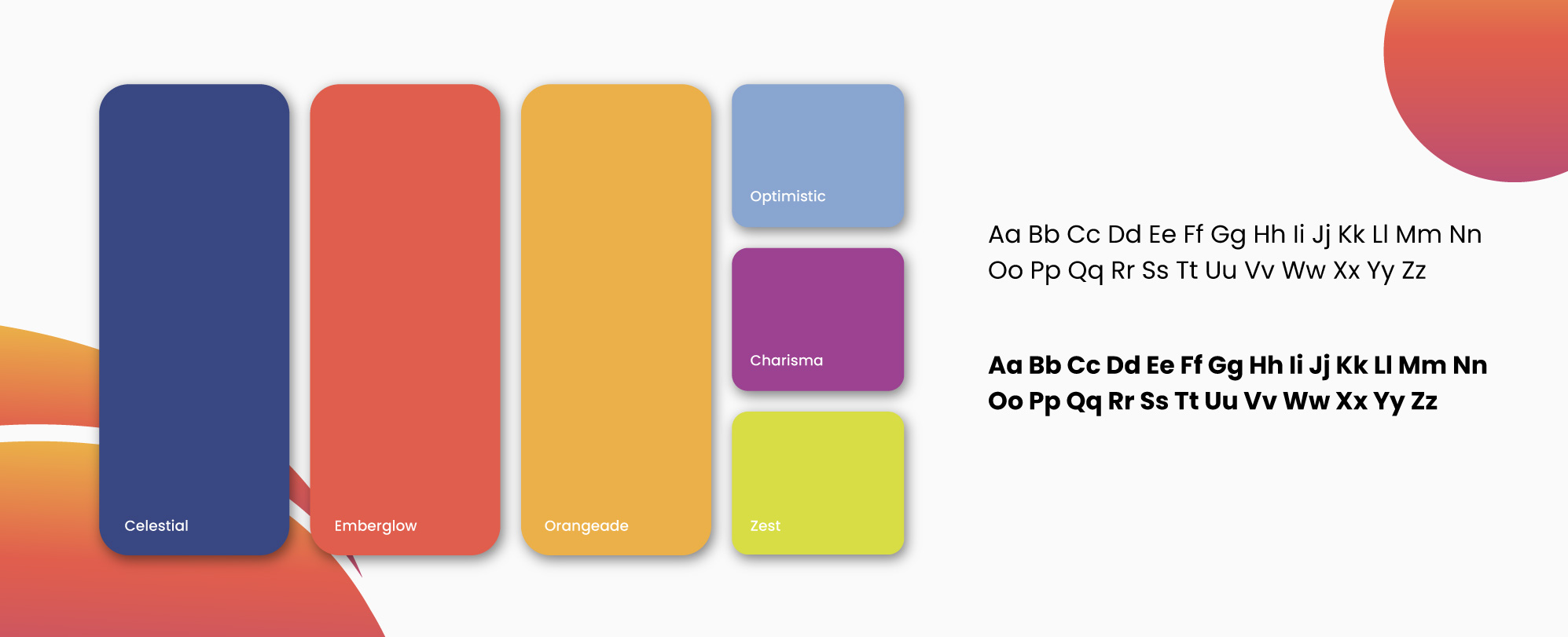
To support this new identity, we created a custom color palette that exudes hope, warmth, professionalism, and possibility. With names like Emberglow, Celestial, and Optimistic, each hue was chosen for its emotional resonance and ability to foster connection, confidence, and clarity.
The accompanying color palette weaves together Stellar Blue, Brilliant Amethyst, Coral Rose, and Golden Topaz, tones that reflect professionalism, warmth, gratitude, and vitality. This rich blend allows the identity to feel just as much at home on medical grants and program brochures as it does at donor events or social campaigns.
IN ACTION
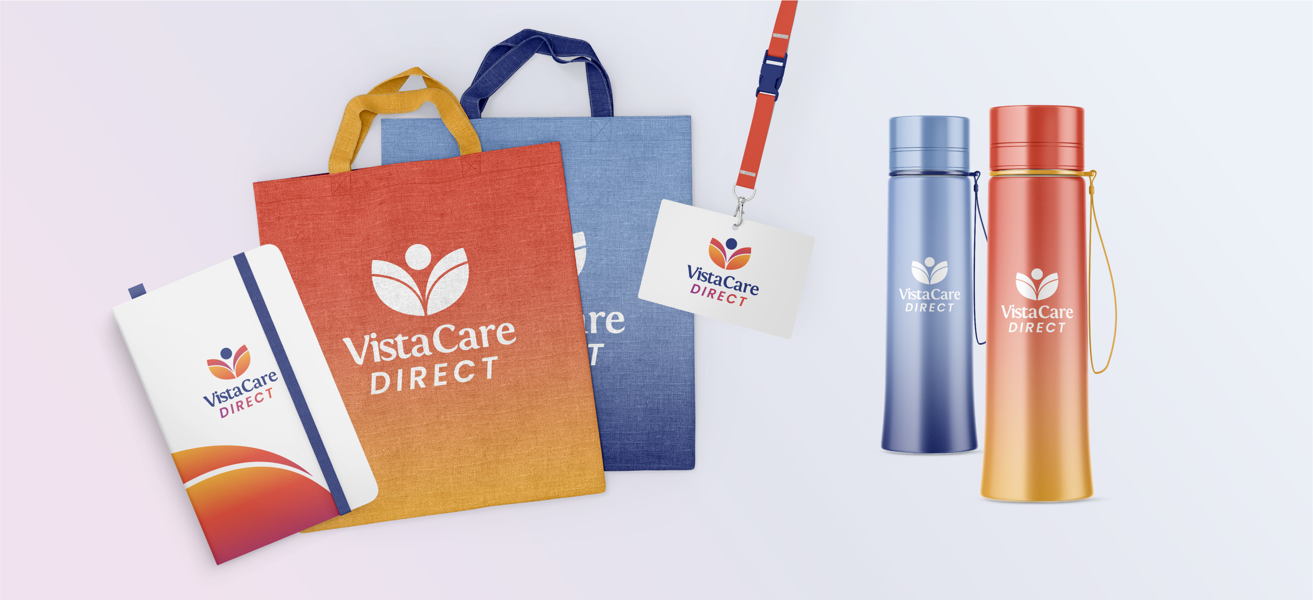
To bring consistency and long-term value to the brand, we developed a comprehensive Brand Standards Guide, a vital tool for both internal and external teams. This guide outlines logo usage, color specifications, typography, spacing, and more, ensuring every visual touchpoint reinforces the Vista Care Direct story. For organizations like VCD, where trust and clarity are everything, brand cohesion isn’t just important, it’s essential.


THE RESULTS
The new Vista Care Direct brand now lives proudly as part of the Vista Care family, with its own vibrant identity, a recognizable visual language, and a toolkit for sustainable brand success. It’s not just a logo. It’s a launchpad for connection, empowerment, and growth.


