The Thoracic Surgery Foundation
LOGO | COLOR CONSULTING | BRAND STANDARDS GUIDE
Unifying a Growing Brand Through Bold Identity
TAK Broadband is a leading provider of broadband infrastructure and connectivity solutions across the Midwest. With a longstanding reputation for excellence in network construction, TAK has undergone rapid growth, acquiring companies and expanding its reach. This period of transformation called for a new, unified brand that could build on TAK’s legacy while confidently leading the company into its next era of innovation.
As TAK expanded, leadership recognized a critical need: to consolidate its various brands under one cohesive identity. They wanted a brand that projected strength, innovation, and forward momentum, all while staying grounded in the values that helped them earn their reputation as a trusted partner in network infrastructure. The new identity needed to serve both legacy clients and new markets, emphasizing speed, power, and reliability without sacrificing professionalism.


Designing a Visual System to Reflect Innovation and Reliability
We started with in-depth stakeholder input through our branding survey to uncover key attributes that the new brand needed to convey. The consistent themes were momentum, innovation, and trust. With these insights, we developed a color palette and logo that would serve as a bold visual anchor across all communications while allowing room for future growth.
Visualizing TAK’s Future with a Modern, Tech-Forward Identity
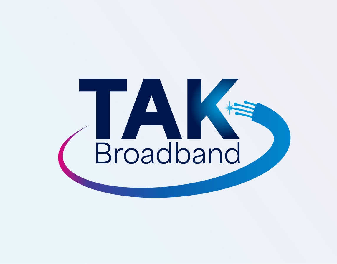
The TAK Broadband identity centers on motion, clarity, and technical strength. The custom logo draws inspiration from fiber connectivity, with a dynamic mark that subtly integrates a spark and directional arrow, symbolizing speed, innovation, and future growth. The bold sans-serif typeface grounds the logo in confidence, while lighter text balances flexibility and ease.
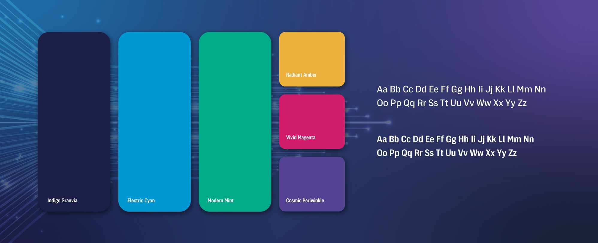
The supporting color palette was crafted to reflect TAK’s dual focus on dependability and innovation. Deep indigo and electric cyan evoke precision and trust, while accents like mint, amber, magenta, and periwinkle infuse energy and optimism, work together to position TAK as a modern, customer-focused leader in broadband infrastructure.
Implementing Consistency Through Comprehensive Brand Standards
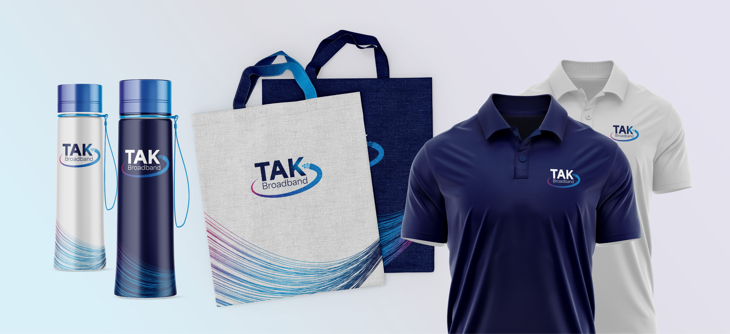
We wrapped this identity with a comprehensive brand standards guide to ensure consistency across TAK’s growing network. It includes logo usage rules, detailed color specs for print and web, type hierarchy, and spacing guidelines, empowering internal teams and vendors alike to implement the brand confidently and correctly.


The Results
With its new brand identity in place, TAK Broadband now shows up in the marketplace with bold clarity and unity. The refreshed visuals capture TAK’s mission to connect communities, businesses, and homes with world-class infrastructure, and its ambition to lead the industry into what’s next.


