Healthy Minds Healthy Children
NAMING | LOGO | TAGLINE | COLOR PALETTE | BRAND STANDARDS GUIDE
Naming, Positioning, & Designing a Brand for Wisconsin’s Newest Mental Health Support Initiative
Healthy Minds Healthy Children (HMHC) began as a movement, not a brand. Initially known as IECMHC (Infant and Early Childhood Mental Health Consultation), the team partnered with Ocreative to launch a powerful policy and public awareness campaign aimed at embedding consultation programs into the Wisconsin state budget.
After a successful legislative win that secured state funding, the team returned to us with their next chapter: create a brand name, logo, visual identity, and messaging framework that could help them grow into a statewide initiative with staying power. It had to honor their mission while feeling personal, approachable, and professional.

The Approach
We began with a deep-dive into stakeholder feedback, service goals, and core values, uncovering universal themes around relationships, partnership, and support. The name “Healthy Minds Healthy Children” emerged from this exploration as a reflection of both their outcomes and their process: adult-centered consultation in support of children’s mental wellbeing.
From there, we built a strategic identity system designed to support public education, state partnerships, and cross-sector engagement with everyone from pediatricians and caseworkers to legislators and school staff.
THE IDENTITY
The Healthy Minds Healthy Children logo is rooted in the idea of progress through support. This warm, modern mark is intentionally open to interpretation, symbolizing:
- A blooming flower, representing nurturing growth
- A looping pathway, showing a clear path forward through complexity
- Interconnected loops, representing multilayered systems of care
The gentle linework creates movement and calm at once, evoking trust, momentum, and care.
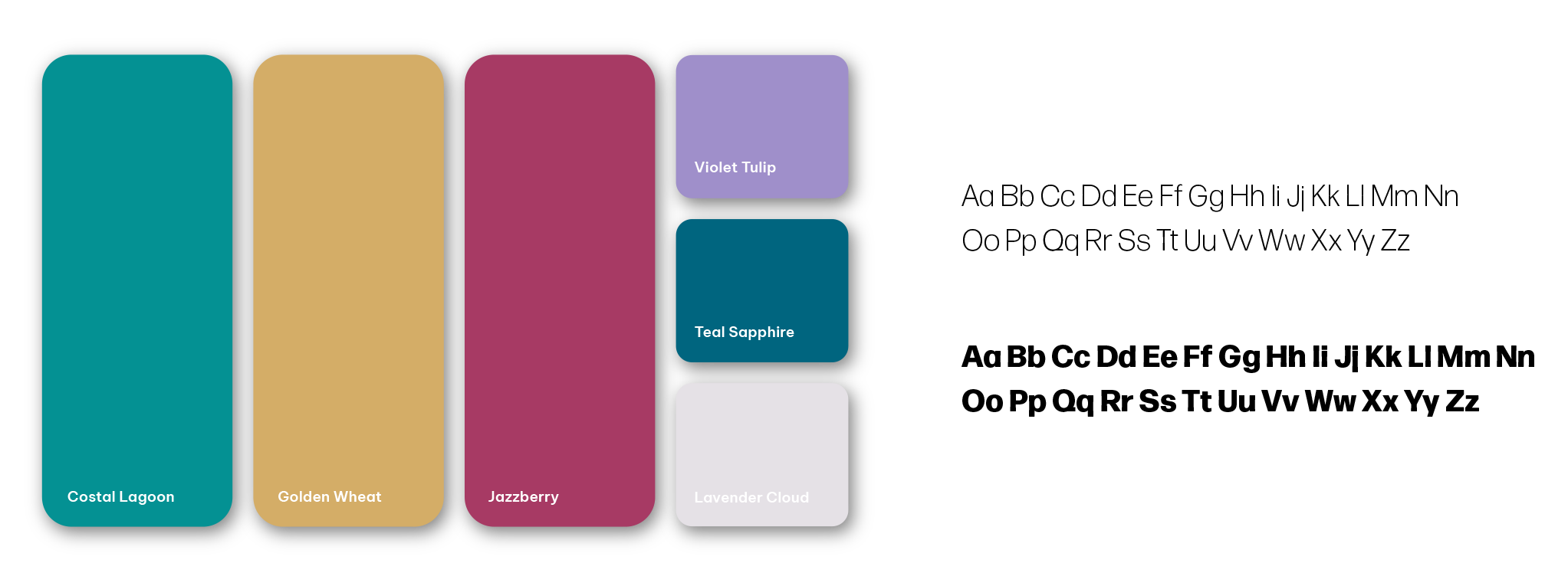
To complement the symbol, we selected a clean, approachable sans serif typeface that emphasizes “minds” and “children” while highlighting the purposeful repetition of “healthy.” The full mark feels fresh, professional, and emotionally resonant, designed to speak to both families and professionals as the program continues to grow across Wisconsin.
The color palette blends Coastal Lagoon, Teal Sapphire, Jazzberry, Violet Tulip, Golden Wheat, and Lavender Cloud—a sophisticated spectrum that brings both warmth and clarity to the brand.
To reinforce HMHC’s mission, we created the tagline:
“Your partner in infant and early childhood mental health consultation.”
This line now guides their outward messaging and mirrors their consultative approach, always human-centered, always grounded in partnership.
IN ACTION
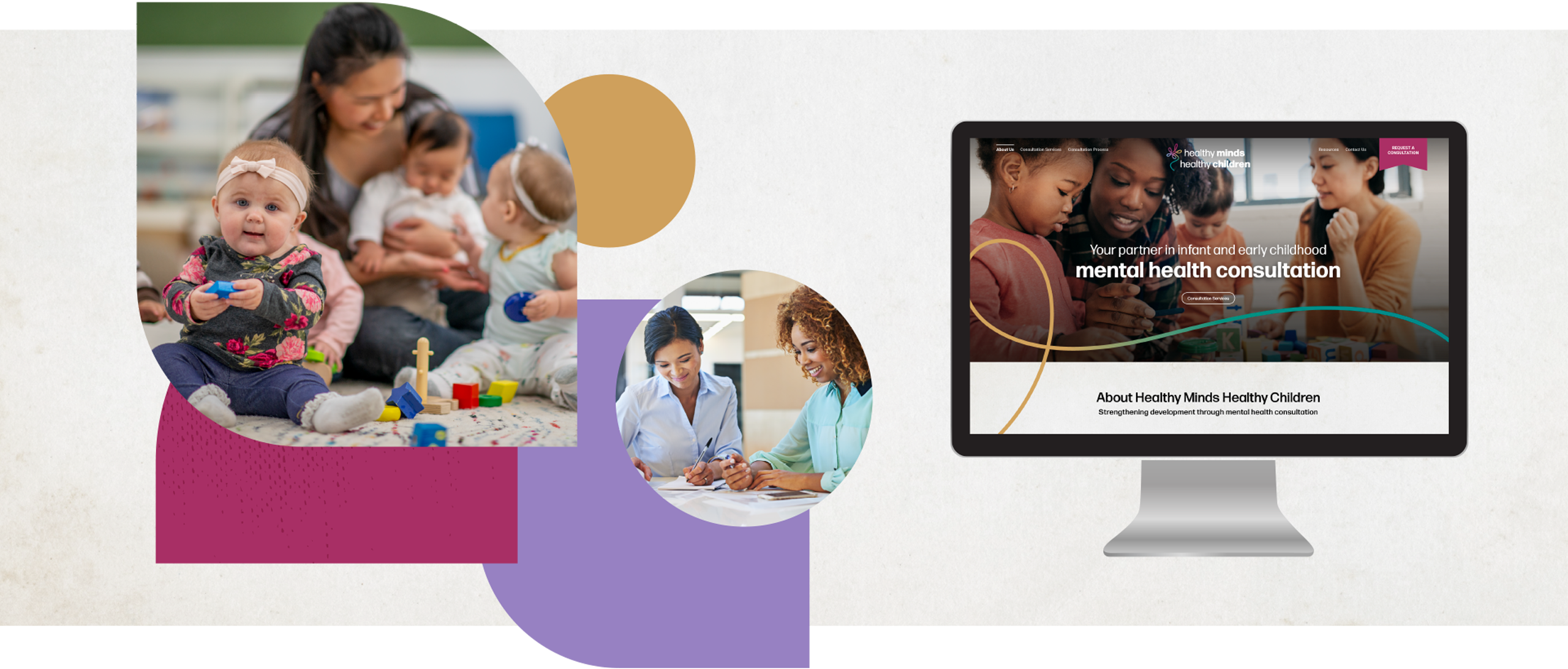
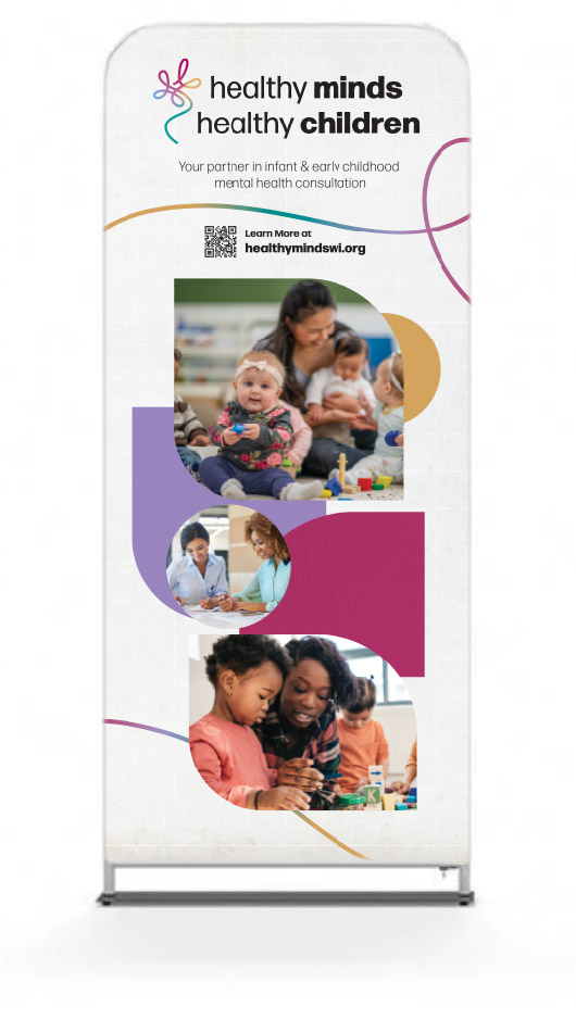
To ensure continuity and expandability, we equipped the HMHC team with a full Brand Standards Guide outlining usage rules for logos, colors, fonts, spacing, and application. This foundational tool empowers internal and external partners to communicate the HMHC brand consistently across digital and print formats.
For an initiative built on building trust, between providers, programs, and families, a cohesive, intentional brand is not just helpful; it’s essential.

The Results
With a name that resonates, a message that empowers, and a visual system that connects, Healthy Minds Healthy Children has emerged as a visible, trusted force in Wisconsin’s early childhood mental health landscape. The brand is now being used in social campaigns, provider training, outreach efforts, and partnerships throughout the state, rooted in the same strong relationships that brought the program to life.

From Policy Win to Purposeful Brand
Lorem ipsum dolor sit amet, consectetur adipiscing elit. Integer in tortor sagittis tortor congue dapibus. Phasellus auctor sem diam, consectetur pellentesque lectus eleifend eget. Vivamus condimentum scelerisque dictum. Nulla arcu ligula, hendrerit nec augue et, vestibulum tincidunt mauris. Morbi laoreet venenatis velit, a aliquet ipsum vulputate quis.
Name of Client | Title

