The Thoracic Surgery Foundation
LOGO | COLOR CONSULTING | BRAND STANDARDS GUIDE
Designing a Visual Identity for the Charitable Heart of STS
The Thoracic Surgery Foundation (TSF), the philanthropic arm of the Society of Thoracic Surgeons (STS), partnered with Ocreative to develop a new brand identity that would honor their long-standing legacy while positioning the organization for modern engagement, visibility, and growth.
With roots dating back to 1988, TSF had evolved considerably, but its visual identity had not. They needed a mark that conveyed compassion, innovation, and momentum, while feeling deeply connected to STS and recognizable within the medical community.


The Approach
Through an in-depth discovery and survey process with TSF’s leadership and board, we uncovered core themes that shaped the design: generosity, excellence, impact, and humanity. The new brand needed to feel hopeful yet professional, timeless yet energetic.
We also understood the importance of connection, visually and conceptually, to STS. Our goal was to create a logo and palette that could stand confidently alone while working seamlessly within the broader STS ecosystem.
THE IDENTITY
The new TSF logo is both symbolic and strategic. Composed of flowing linework, the mark echoes the anatomy of the thoracic region, a pair of lungs enveloping a heart. But it also tells a deeper story: of two human figures in motion, leaning in, as if to perform surgery or offer care. At the center is the heart, bold, compassionate, and unmistakably charitable.
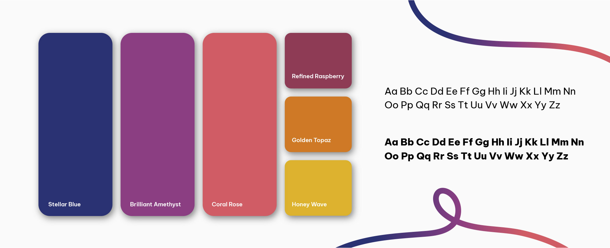
To ground this visual storytelling, we paired the mark with a strong, clean sans-serif font and a stacked wordmark structure that reflects both clarity and cohesion with the STS brand.
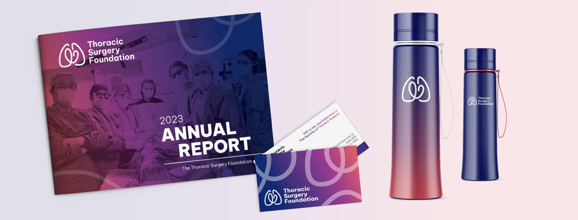
The accompanying color palette weaves together Stellar Blue, Brilliant Amethyst, Coral Rose, and Golden Topaz, tones that reflect professionalism, warmth, gratitude, and vitality. This rich blend allows the identity to feel just as much at home on medical grants and program brochures as it does at donor events or social campaigns.
IN ACTION
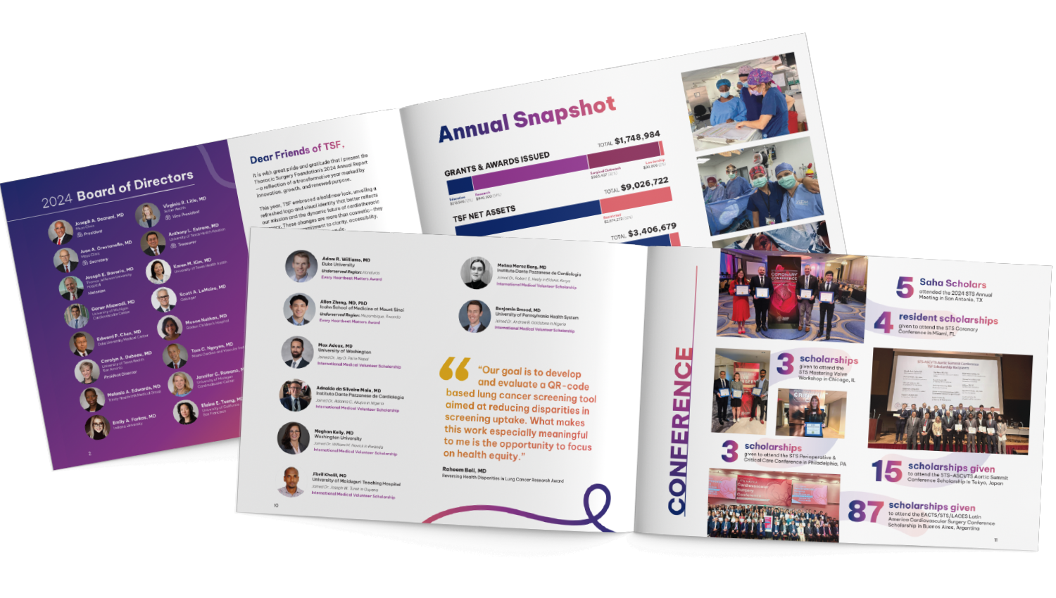
To protect and elevate the TSF brand over time, we also created a comprehensive Brand Standards Guide. This document provides detailed direction on logo usage, typography, color specs, spacing, and alignment with STS branding, ensuring that every touchpoint, whether digital or print, reinforces TSF’s mission and builds long-term recognition.
For an organization driven by generosity and scientific excellence, brand consistency is more than a design principle, it’s a promise of trust and impact.


The Results
The new identity has given TSF a fresh foundation from which to grow, fundraise, and connect with audiences in new and lasting ways. It reflects the strength of its past while welcoming a new era of philanthropy, innovation, and thoracic surgery leadership.


A Brand That Honors Legacy While Embracing the Future

Lorem ipsum dolor sit amet, consectetur adipiscing elit. Integer in tortor sagittis tortor congue dapibus. Phasellus auctor sem diam, consectetur pellentesque lectus eleifend eget. Vivamus condimentum scelerisque dictum. Nulla arcu ligula, hendrerit nec augue et, vestibulum tincidunt mauris. Morbi laoreet venenatis velit, a aliquet ipsum vulputate quis.
Name of Client | Title


