Oconomowoc Area Foundation (the OAF)

Branding

Redesigning the Digital Hub for Anesthesiologist Assistant Program Oversight

The Oconomowoc Area Foundation connects generous community members with impactful causes in the Lake Country area of Wisconsin. As a local affiliate of the Greater Milwaukee Foundation, OAF serves as a philanthropic backbone for the region, supporting nonprofits that address pressing community needs.
Oconomowoc Area Foundation Logo

Defining a Clearer Identity to Drive Community Impact

The OAF team came to Ocreative with a need for a refreshed brand identity that would better reflect the Foundation’s role as a forward-looking, community-focused catalyst for positive change. The original identity lacked cohesion and visual strength, making it difficult to convey the Foundation’s purpose and growing impact in the community. The goal was to develop a new logo, color palette, and brand system that honored their history while building recognition and excitement for the future.

Crafting a Cohesive Brand Through Collaboration

We began by listening closely to the OAF board and other stakeholders to understand what the Foundation stood for, and how they wanted to be perceived moving forward. Our design team developed a range of logo concepts, each rooted in a different interpretation of OAF’s mission:

  • A child reaching for a star, symbolizing opportunity and aspiration.
  • A bold, typographic approach layered with organic patterns, representing interconnectedness and growth.
  • A modern reimagining of their well-known “Philanthropy Blvd.” street signs to emphasize OAF’s role as a guide and beacon for local giving.

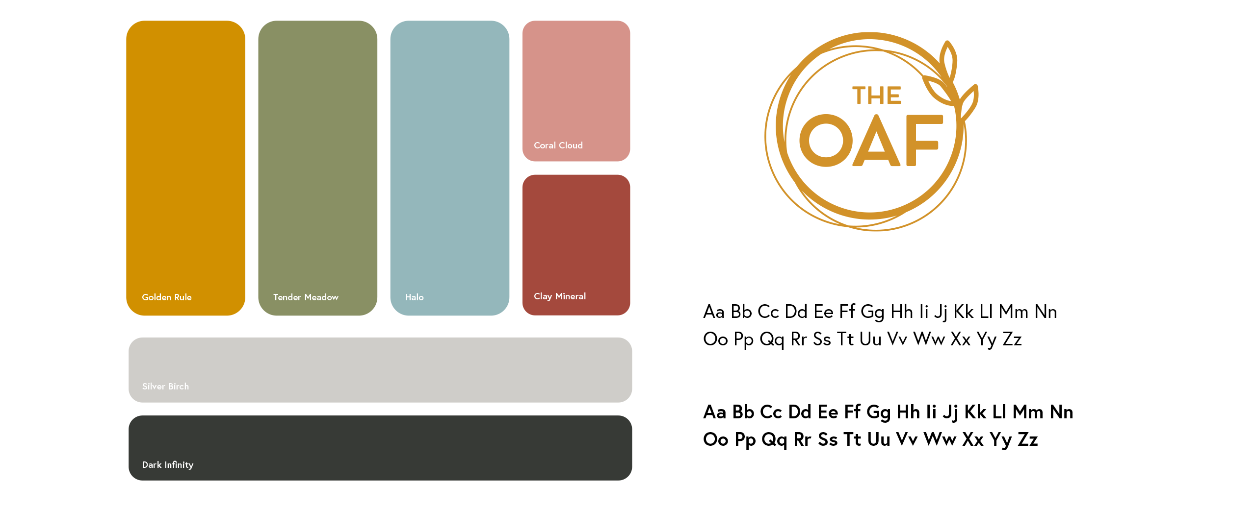
Once we landed on the strongest direction, we refined and finalized a visual identity that balances professionalism with warmth, movement with clarity. We built a comprehensive brand guide with typography, color palettes, logo usage, and visual assets to ensure brand consistency across platforms and media.

The OAF Branding Colors and Fonts
The Oconomowoc Area Foundation Branding Background

THE RESULTS

The new OAF brand identity positions the Foundation as a dynamic, trustworthy, and inspiring force in the Lake Country community. With a revitalized logo, flexible branding system, and color palette designed to evoke warmth, trust, and momentum, the OAF is now better equipped to tell its story, build awareness, and drive engagement from donors and community partners.

From early logo sketches to a complete brand standards guide, this transformation reflects the heart of the OAF mission: investing today to build a brighter tomorrow.

Oconomowoc Event For the Area Foundation

Building a Brand with Local Heart

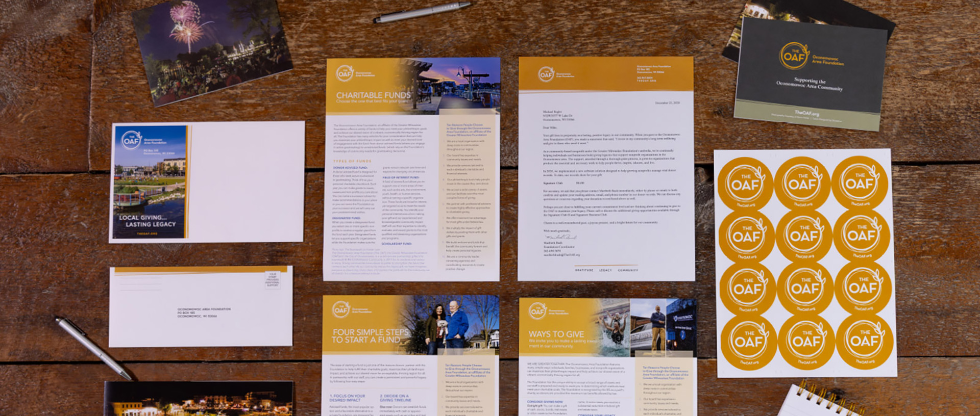
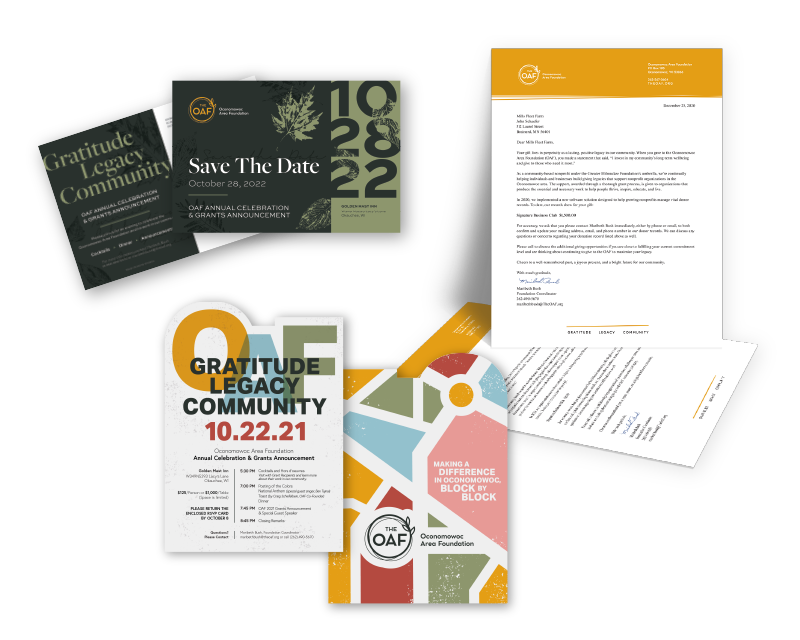
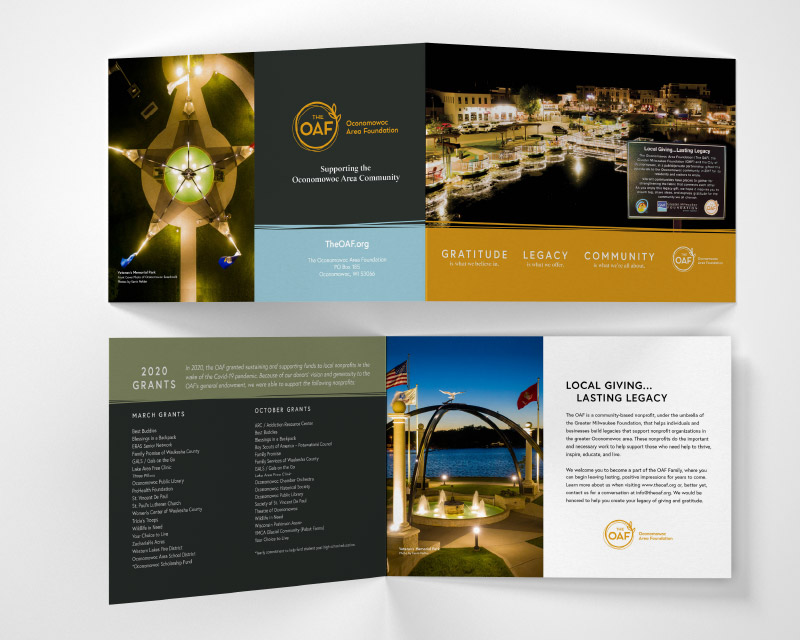
Branding Materials Designed by Ocreative
Letterhead and Business Cards Designed by Ocreative for OAF
Print Materials For Oconomowoc Area Foundation
Orange Quote Marks

Lorem ipsum dolor sit amet, consectetur adipiscing elit. Integer in tortor sagittis tortor congue dapibus. Phasellus auctor sem diam, consectetur pellentesque lectus eleifend eget. Vivamus condimentum scelerisque dictum. Nulla arcu ligula, hendrerit nec augue et, vestibulum tincidunt mauris. Morbi laoreet venenatis velit, a aliquet ipsum vulputate quis.

Name of Client | Title

Start Your Own Success Story